I don’t know if I like defects.
I know I don’t like discovering them.
This afternoon’s story unfolded this way:
1. HP’s inks arrived about an hour ago, and, indeed, “Bertha” (infamous behemoth of a B9180 ink jet unit) needed her cyan; powered her up; fed her a full ink cartridge; deleted from the printer’s memory the two earlier jobs on which she stopped for want of her cyan; and started a simple, small job, i.e., the second snow snapshot from the latest post on the more personal blog.
2. Out of paper! Where did I put the remainder of the Ink Press? For a while, I couldn’t find the box, so I rummaged out of the back of a closet a few damaged sheets of Epson Pearl, 11 x 17, and cut that down to 11 x 12, removing some bent corners . . . only to learn that Bertha’s instructions (software) didn’t seem to want me to load an odd-sized paper — and then: the missing package? on top of the printer . . . .
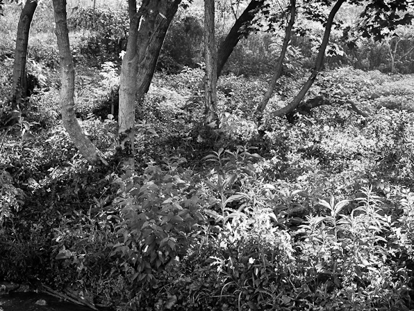
3. Loaded 11 x 14 and ran a print. Not bad. A little reddish for a near monotone piece. So I ran another, an old leaf heavily back lit.

That above came out of the printer noticeably striped.
It made me wonder if I had looked hard enough at my latest prints.
I use a 5,000K CFL for editing (Lacie 320 monitor; Macbeth color charts and other guides; plus I’m “tuned down” about 10 percent or so, and somewhat compromised between ambient interior brightness and print impact — I need a slightly brighter edited “print” to get a good looking real space print for indoor display), but (reminder: I was talking about my office light source), I have it aimed at the ceiling for indirect and dim room lighting (the monitor is everything).
Well . . .
I reversed the CFL bulb (it’s in a workshop reflector), put on the “readers” (1.5x) and looked again.
What I found: light striping and perhaps, in the last few prints, what looks like magenta cartridge misalignment.
One has to really look, up close, magnified, to see this stuff.
Very light, or what I call “faint” artifacts may be ignored — the image impact is such that such have to be pointed out to be “seen”.
And some things may add charm the way a nub or two might a sweater.
Still, I’m not one to send out work with industrial-strength grooves in it.
For the moment, I have half a dozen prints — should they be called “seconds”? — set aside and unlisted.
Of the listed: fine for the wall, but . . . Bertha’s tiring me out.
I’m going to align Bertha’s print heads, run some proofs, and come to a decision about sending her on to my county’s recycling program.
Boutique printing — very limited edition, totally hands-on, also at the mercy of technology or involving some struggle between the artist and the unruliness of the machinery — is not high output lithography. For some barely visible qualities, some “small shop” artifacts may add to charm. Such become indicative of a period in a shop’s history.
On the other hand:
I WANT PERFECTION!
Enough said.
* * *
In the order signed:
Black Eyed Susans: 1 – 11×14 Ink Press Luster, 10-1/6 x 12-3/4
Black Eyed Susans: 1- 11×14 Ink Press Luster, 6-1/4×10
Three Susans: 1 – 11×14 Ink Press Luster, 13-11/16 x 9-5/8 slightest banding, invisible head-on
Mumma Farm Outbuilding 1- 11×14 Ink Press Luster 6-3/8 x 9-5/8
Peeling Paint, Mumma Farm Building (first of the three at URL location)- 2 – 11×14 Ink Press Luster, nominal 1/8-inch border, soft
Peeling Paint, Mumma Farm Building (first of the three at URL location) – 2 – 11×14 Ink Press Luster, 8-1/8 x 5-1/16 (soft)
Blue Treetops – 1 – 11 x 14 Ink Press Luster, off-centered 6 x 10-11/16, blurred and textured (very arty)
American Farm Girl: 1 – 11 x 14 Ink Press Luster, no border, slightly stripped, ink droplet, left side.
American Farm Girl: 7 – 11 x 14 Ink Press Luster, bordered 3/4-inch nominal, faint striping, high impact print; some borders smudged.
American Farm Girl: 1 – 11 x 14 Epson Glossy, bordered 3/4-inch nominal, faint striping, some borders smudged.